Everett, Logo Designs, and Consignment
Four months after moving to Seattle, an article was posted in the Seattle Times encouraging local artists to apply themselves to the task of a rough draft for a new logo for the neighboring city of Everett.
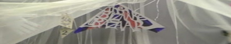
The idea intrigued me for a few different reasons. One, my portfolio is slim in general, but I had been papercutting for years, and while my brother is way more talented than I am, I love doing artwork on a theme. Two, I didn’t quite know exactly what made Everett different from Seattle at that point: it was all new to me. Three, I once managed to win a competition at work as a teenager by being the only entrant. I wasn’t sure what my odds were, but if they weren’t using a professional service, then they probably were looking for something different than the current public standard.
I set out to explore my new neighbor. Their tourism page described Everett as a hub of burgeoning industry, with microbreweries and restaurants to visit, as well as being a staple to those working at Boeing by being so close to the facility.
My son and I did a few small trips into the area to get a feel for it. I also decided to dig into the history as well, starting with my old familiar friend, the library. I built a few drafts for myself – my favorite one was inspired by the streetlamps along Evergreen Way. If you’ve ever seen them, they have this great asthetic, while still having a hint of straight-lined art nouveau. They have a mellow green about them, faded, maybe?
I made a vector-friendly Bookmobile image, but that would have been more for the library than for the public works division. I looked for virtual or hard copies of it, but didn’t turn them up.
And there was one based on a common-domain image from the archives of a publication from around 1910.
In the end, I don’t think I managed to submit any of the drafts before the deadline – I wasn’t satisfied with them and was treating job hunting as a full-time occupation. (Without a scanner I had trouble editing the ones that I had.)
For what it’s worth: this link full of reactions really, REALLY does nothing for one’s confidence in trying to “freelance” until you have a portfolio post-college.
The real nail in the coffin was when the media and comments crucified the winning design. The logo that was chosen was a design that happened to incorporate certain design elements that were extremely close to a corporate logo for Envestnet, a financial investment company. I know it was a learning experience for everyone involved.
I can’t complain – it was something that was fun to get excited about, and was great to help wrap my head around the area I had moved to. In the end, if I hadn’t attempted it, I don’t think I’d ever have had the confidence to put some of my work up for sale as prints and jewelry accessories in the “Spooked in Seattle” Consignment shop.
(Speaking of which, Halloween is coming! Go on a ghost tour! Shameless plug!)
As for the Everett Public Works sector, it looks like they’ve quietly moved on to a new logo on their website (I found an article about it), which is fine:
It’s a very serene logo, and I’m thinking that they can probably leave it there for a long time – at least until the next logo sourcing competition, anyway.
